Overview
This re-design was inspired after reviewing the current state of the Harvard website. After some research and user testing I came to the realization that for a very prestigious Ivy league school like Harvard, their website or app is not the most user friendly. So I decided re-design the Harvard website app to become more user friendly to visitors and students.
Client: Harvard University
Duration: 14 Weeks
Team: Daniela German (myself)
Role: Researcher and Designer
Tools: Adobe XD
Process: Research, Ideate, Branding and Prototype
Goal
To redesign the Harvard website in mobile form, to be more user friendly, clean, and simple for students to navigate through.
Problem
Some of the problems users came in count with when browsing through the Harvard website are:
1. Overwhelming amount of navigation tabs.
2. No clear direction on where to find specific pages.
3. Not enough contrast in overall website and hard to find information.
2. No clear direction on where to find specific pages.
3. Not enough contrast in overall website and hard to find information.
Research
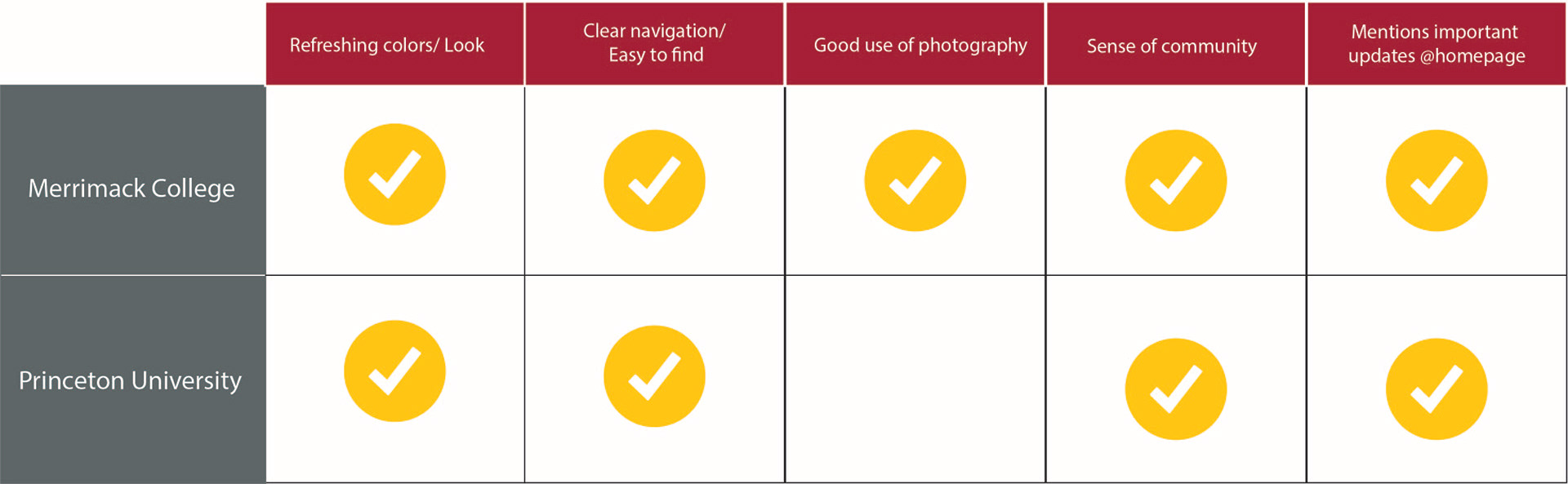
Competitive Analysis
I created a competitive analysis of research I did of different universities that resemble that victorian style that Harvard has as their brand identity. I took into account the elements I believed worked of those websites and that I could potentially use for inspiration.
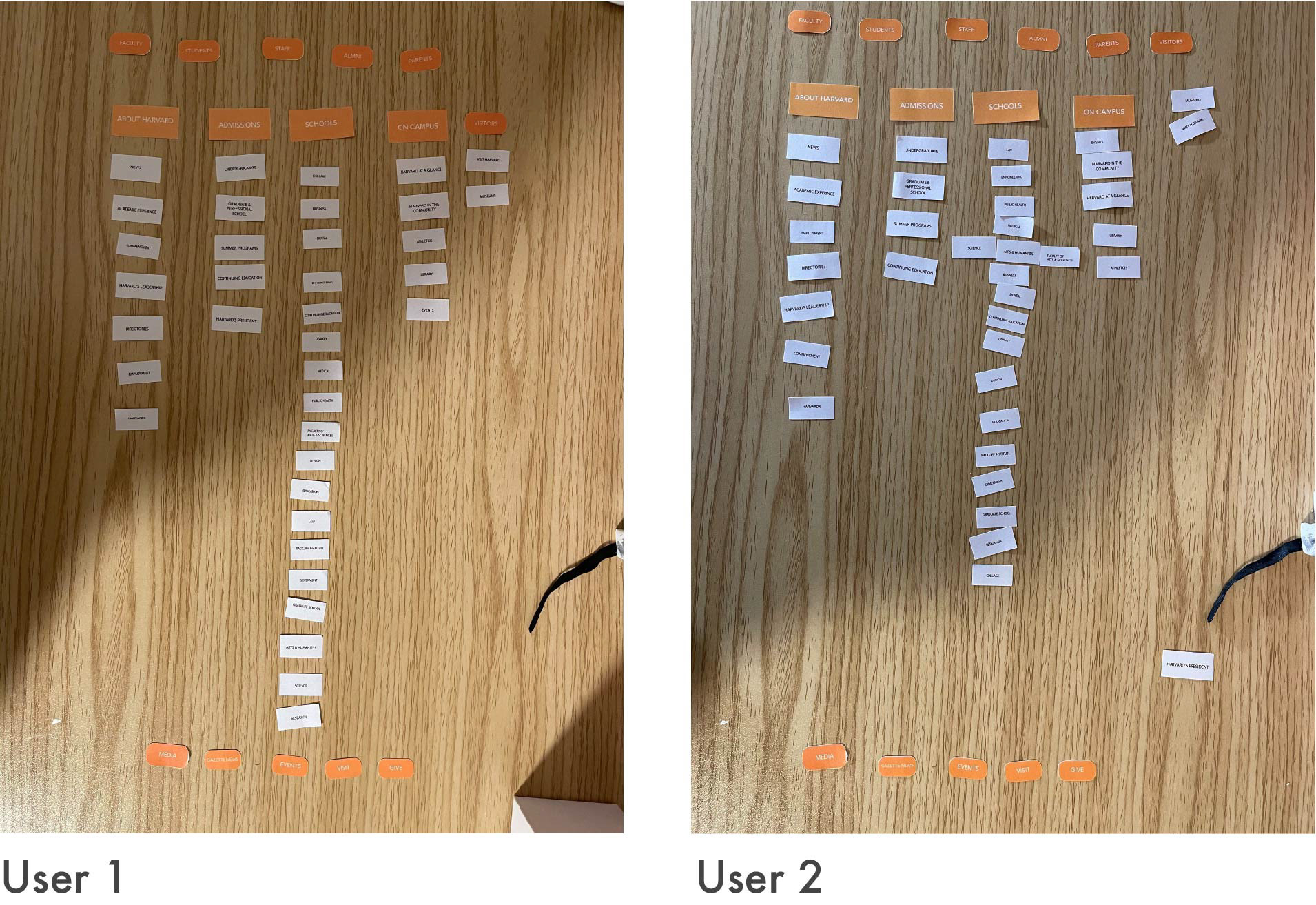
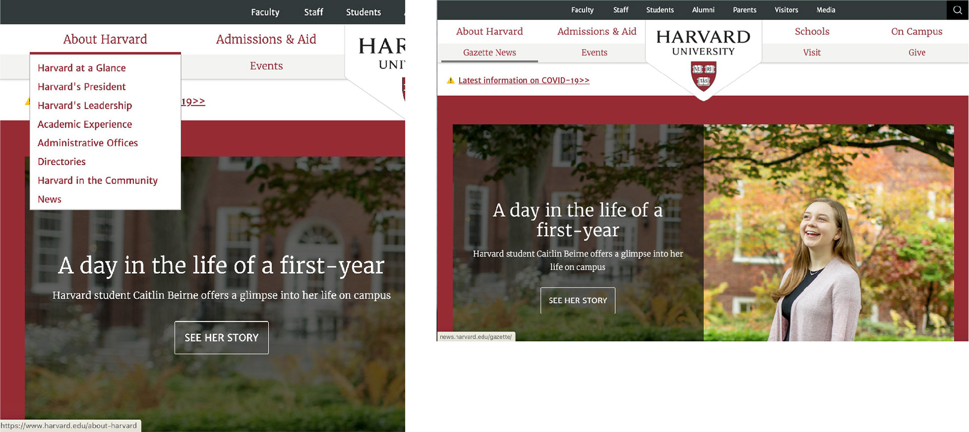
Usability Testing - Card Sorting
Results
The two users that tried the sorting both had similar complaints. The most popular complaint was that some sections where set into the wrong navigation tab, which made it difficult to find when needed. One user specifically mentioned that it was really difficult to find the site for transfer students.
User Flow
Results
These are a the results of a user testing I did with the same user as the card sorting. Below are some of the feedback I received from redirecting the users to give an overall review of the Harvard website.
User 1
- Too much red
- Not enough difference between navigation bars
- All fonts look the same size
- Too much red
- Not enough difference between navigation bars
- All fonts look the same size
User 2
- Overall website way too congested.
- Not enough color contrast
- Search button is tugged to the corner, not easy to find.
- Overall website way too congested.
- Not enough color contrast
- Search button is tugged to the corner, not easy to find.
Site Map
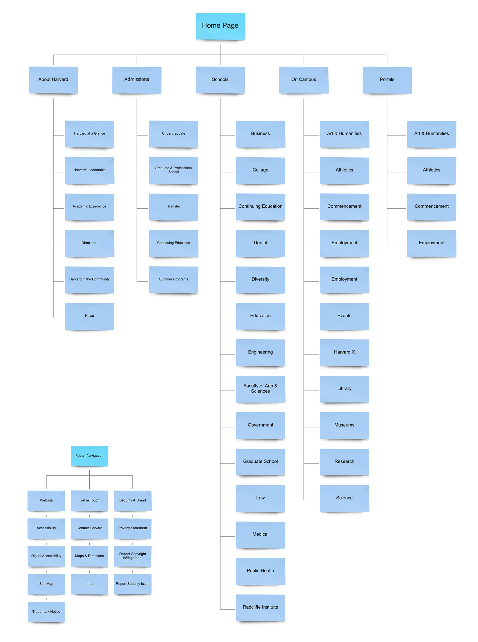
Results
This is the simplified solution I came up with after analyzing the user testing results. I rearranged the sub contexts to locations that made more sense for the users to find easier. I also created the main navigation to be much more simple, clean and easier to navigate.
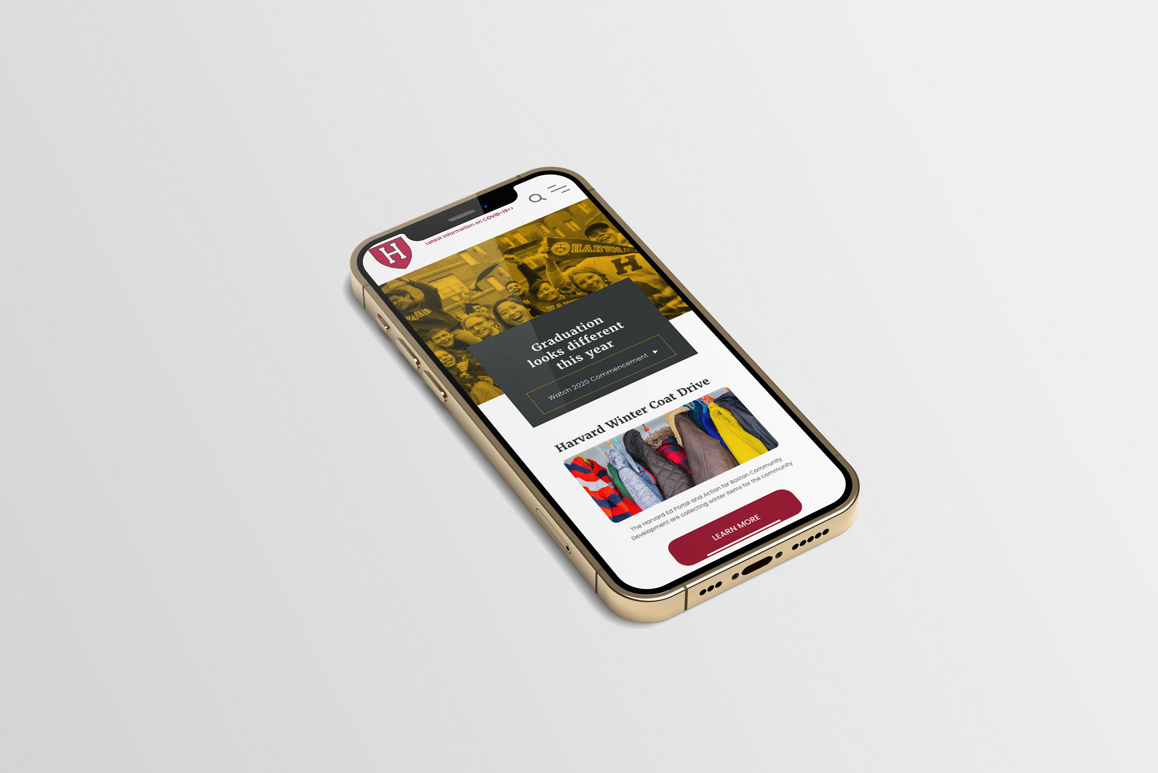
Final Solution
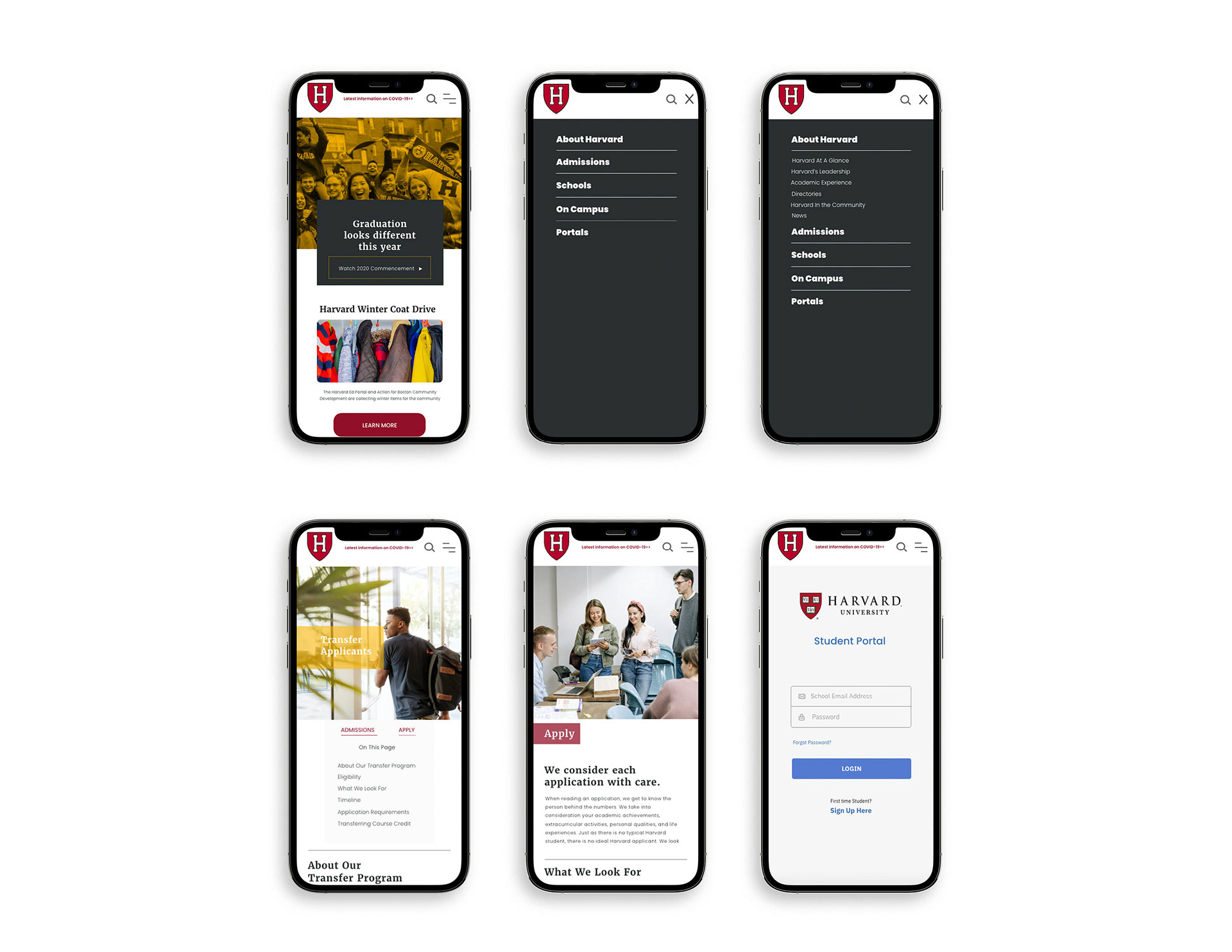
Final Prototype
Check it out!
Browse throw the homepage,
transfer, and student portal.
Browse throw the homepage,
transfer, and student portal.